I decided to join the Northern Print artists in creating a 20:20 edition (of 25 prints + proofs) for 2023. Things changed a bit this year in that we had to start thinking of creating our editions much earlier in the year. Unfortunately I had a minor accident and ended up in hospital for three weeks which delayed progress but gave me thinking time.
I spent a lot of time perusing photos I took about 10 to 12 years ago. Initially, I’d considered doing a still life composition of a small Japanese coffee cup, saucer & plate with cake and printing on thin Kozo paper. The biggest problem was that I couldn’t reduce the colours down to less than five which were too many.
Eventually, I gave up on their idea. I thought about one of my photos of the demolition of Spillers Mill. I couldn’t find the exact image I wanted and those I could find required too many colours to work as a print.
Eventually, I found a photo taken in a Norfolk coastal town of a sweet shop window, one of a number of photos I took of shop windows on that trip. I thought it could work well as a three-layer print in cyan, magenta and yellow. I decided on a Euclidean dot (hexagonal, I think) for the cyan layer, a fine diamond dot for the yellow, and tried two versions of round dot for the magenta layer. Proofing proved that a) the bigger, coarser dot worked best; and b) rather than the usual order of cyan, magenta, yellow, it worked better as cyan, yellow, magenta (jar lids looked redder rather than orange).


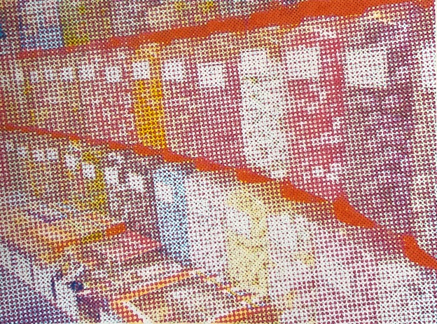
These colour proofs show cyan and magenta layers, with the finer round dots magenta.


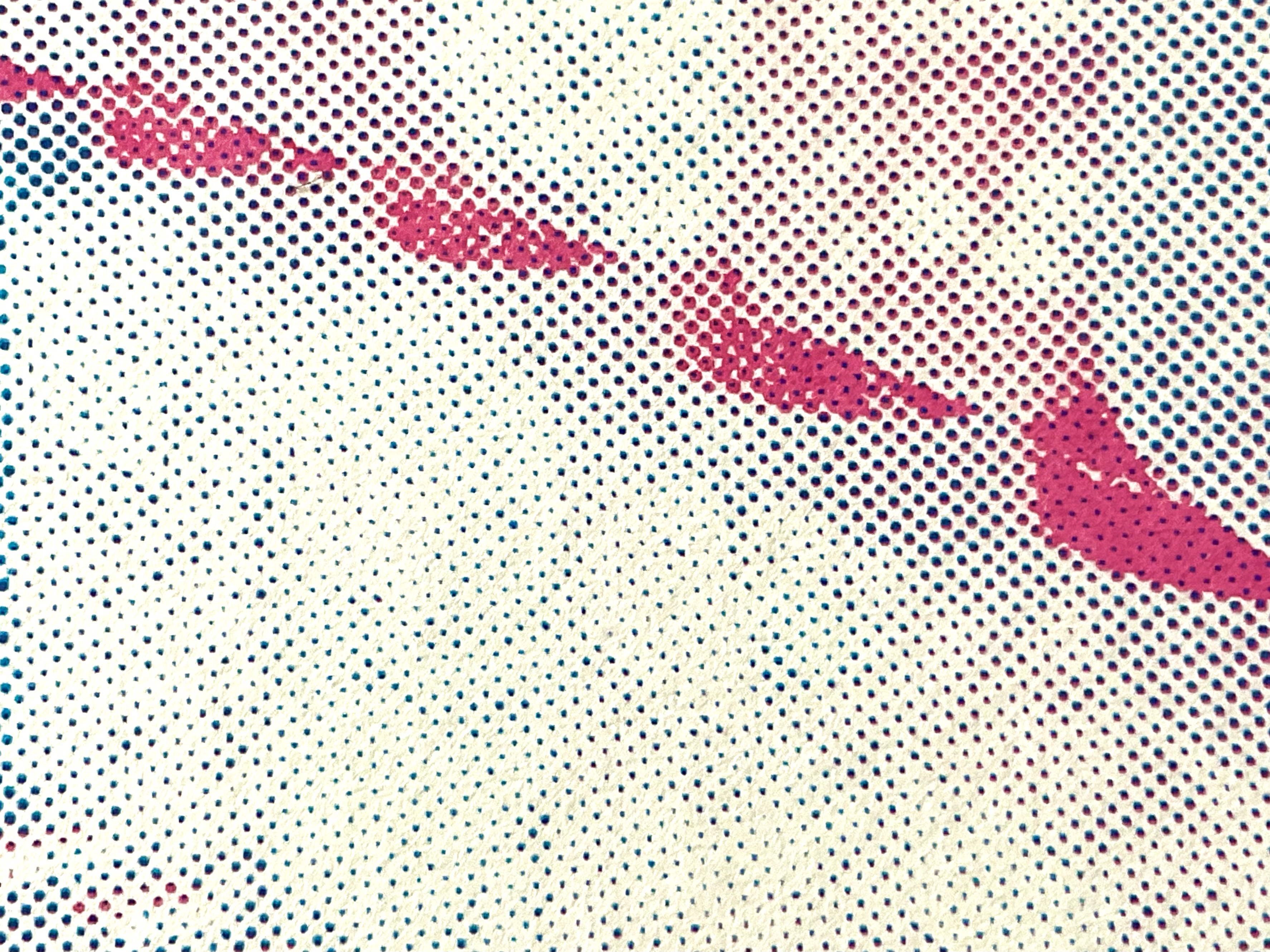
These colour proofs show the cyan and yellow layers only.
The standard order of colours in screenprinting is CMYK (Cyan Magenta Yellow Black) but the yellow overwhelmed the magenta too much.


The above images have yellow printed over the magenta (larger dot version) and cyan.


These show the magenta (larger dot) over yellow and cyan. The difference may not look huge but it works better.
I deliberately went for a mix of fine dots on the first two layers and larger dots on the top layer so that the image starts to become more abstract and refers to the kind of textures and patterns seen in Pop Art screenprints in the 1960s.

This won’t be my last shop window print.
I am immensely grateful to Northern Print for all their help in getting this edition printed.