Thank you very much to Northern Print for running this course on 19th September 2015, despite not filling all the places. We were able to do things a bit differently because there were fewer of us learning, and that meant we could try out something that went beyond what I’d hoped to do on the course.
For those unfamiliar with solar plates, also called photopolymer plates, these are photo-sensitive plates that are developed in water and light. The plates we used were backed with metal. First, the course tutor, Helen, gave us a summary (and several pages of notes) of how this method of printing works, and showed us lots of examples of plates and prints. I particularly liked the plates made from Thomas Bewick prints.
-
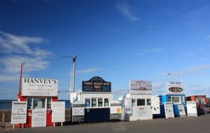
- Seahouses harbour
-

- Seahouses harbour – inverted image on acetate.
-

- Seahouses harbour solar plate
-

- Seahouses harbour solar plate print.
Trying out the method for ourselves, we started with digital images and Helen showed us the stages of turning them from colour or black-and-white images into (in the case of the photos) the negative half-tone images, correctly sized for the plates. These were printed onto a special type of acetate and then the plates were placed over the acetates on the ultraviolet lightbox, with newspaper to protect the rubber vacuum seal, and exposed to the light). We developed them for a few minutes, and then we were ready to try printing. My inking up on this test plate was not good, but I could see how it worked. I chose this image because it has words on the signs and I wanted to see how much detail would be retained even in a small A6 print.
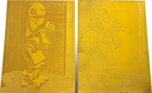
After lunch, we tried our second plate. I chose a photo I took of Data the Robot at a Thinking Digital conference a few years ago. He was a social robot who told jokes and danced. I decided to try a duotone image that needed two A5 plates. First, I had to split the channels (don’t think I can do this on my computer at home, unfortunately). I chose to print the red and green channels.
-
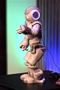
- Original photo of Data the Robot.
-
- Red and green channel images printed onto acetate.
It wasn’t until after we had exposed the plates to UV light that we remembered that we had forgotten to invert the image to create a negative, but decided that it didn’t matter in this context.
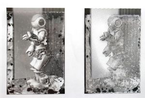
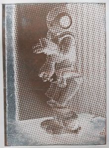
-
- Robots solar plates.
-
- 1st print from the 2 Robot plates.
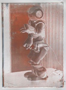
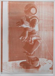
I chose a mid-grey ink to use on the smoother textured plate, and a coral on the dotty plate.
-
- 2nd print using both the plates, mid-grey ink on the smoother plate with coral on the dotty plate.
-
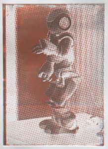
- Dotty Robot print in mid-grey (over coral).
-
- Smoother Robot plate printed in coral over grey.
-
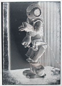
- Dotty robot plate printed in black (previously printed in coral and grey).
I liked the results, and think I will try printing this plate again, probably in different colours. I still need more practice at rolling ink onto plates, but I did learn a bit more about how to do that too during this course.
Ideas started popping into my head even on my way home, and a world of possible combinations of different types of printing started to whirl around because these are types of plates that I can work into after they have been made, or combine with drypoint, and use the viscosity method of printing. I was very glad that I did this course. I learned a lot and the other people on it were lovely. As an art historian, I like to understand the methods of producing art so I understand artworks better. As an artist, understanding how to do things opens up new ideas of what I can do. I will start putting these diferent methods together more as I feel more comfortable with them, but the need to keep trying things to improve my techniques won’t stop me from having a look at what other courses I might do next (not least because there will be new courses next year that I’ll want to try).