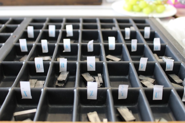
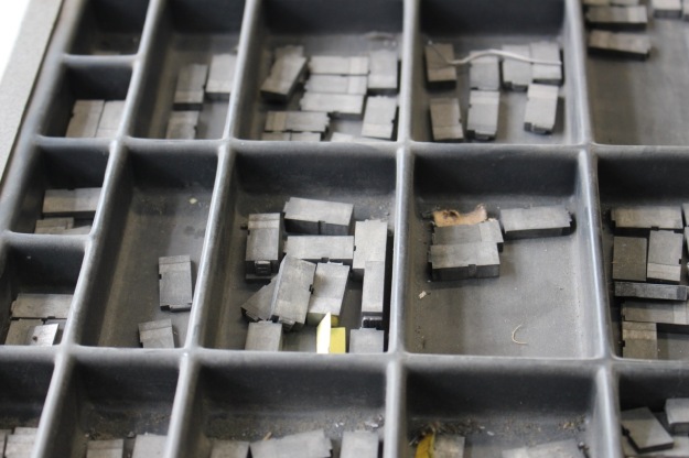
Part of a double case of type before cleaning and sorting.
This is part of Northern Print‘s Letterpress – A Lasting Impression project. We were starting the cleaning and sorting of numerous unidentified cases of type. Given the choice, I decided on a double case that contained quite a large font so it would be easier to see. We opted to work in the Education Room so we had plenty of room, light – and could have cups of coffee as we worked (the latter isn’t allowed in the studio downstairs for sensible health and safety reasons).


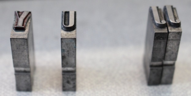
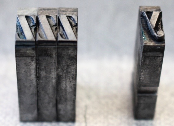
One of my fellow volunteers, James, demonstrates in the photos above how we tackled the task. A small table-top kind of vacuum cleaner was useful for removing the worst of the dust, fluff, bits, fragments of feathers and what appeared to be mouse fur. We took the type out, wiped the compartment with baby wipes (for sensitive skin), wiped the type with baby wipes. Then we checked what character, spacer or punctuation mark was on the type and whether all matched, inked and printed one of them by hand to check what it was before either stamping or writing it onto a label (smaller fonts were better written on the label so more legible), and returning all matching type to the compartment – and repeating with the next one.


We will be printing a sample of the characters from the cases we clean to send up to Robert Smail’s Printing Works for help with identifying what typefaces we have. For temporary reference purposes, I decided to call my case ‘Fred.’ Until we know their names, we need to identify the cases somehow and I came to the conclusion that any name that is clearly not a serious traditional typeface name is more memorable than a number. Spending so much time with a case made it feel quite personal so a name also seemed more appropriate.
The new labels on the compartments are just temporary. Another task will be to decide on what the case lays or layouts should be. Some that we looked at seemed to be in alphabetical order which is not a usual printer’s way of organising them. The characters include some not used on typewriter or computer keyboards. Some fonts have different characters so would need different case lays. It appears that most of the cases are double case rather than divided into upper case and lower case. The case I was working on is a double case.


I wasn’t sure if this was the sort of task I would enjoy or find tedious. Fortunately, I really enjoyed it (I also had lovely company as other volunteers were there) and was reluctant to leave by the end of the afternoon. There is a sense of satisfaction in cleaning and ordering cases. All my training in heritage collections makes me want to record it all in detail. I may have to create spreadsheets to record what’s in the cases for my own peace of mind (and so we can see more easily what characters we might need – from our first day, it seems that there are some missing).
I’m looking forward to doing more.