Selecting the subject
When I was shopping for groceries one evening, I noticed that some bunches of anemones had been reduced to half price. I can’t afford to buy flowers often these days, and very cheap daffodils are usually my limit (and even then I try to limit myself to half price ones that are already a bit wilted). When I saw the pink anemones, I knew I wanted to put them against a yellow or orange background to paint them. There were 7 blooms but one had a broken stem, and 3 looked the right number for the size of the vase.
My relationship with the vase
I assume that the vase was mass-produced for the Western market. It’s hand-painted, and I do feel a little anxious still that the person who painted it might have been paid very little, even though it was probably made decades ago. My mother has a teaset (inherited from her parents, I think) with very similar figures but on a brown background, so the imagery on it has been familiar to me since I was a baby. I noticed decorative china as a very small child. My grandmother had cups and saucer decorated with pink roses. Elderly relatives had a gold lustre coffee set in a china cabinet in their front parlour. I doubt that they ever used it.
Starting the still life – drawing and first colours

Janet E Davis, 3 pink anemones in an oriental vase – stage 1, tinted charcoal on canvas, March 2014.

Janet E Davis, 3 pink anemones in an oriental vase – stage 2, acrylics and tinted charcoal on canvas, March 2014.

Janet E Davis, 3 pink anemones in an oriental vase – stage 3, acrylics and tinted charcoal on canvas, March 2014.
Thinking about the composition
I have deliberately chosen a composition that shouldn’t work. It is not balanced in terms of the placement of the vase and flowers and the detailed, multi-coloured part of the scarf that naturally attract one’s gaze. I’m interested to see how it will turn out. The anemones moved between the time I was drawing them and starting to put the paint on the blooms the next morning. The scarf slipped overnight. I like these movements. I don’t want to draw still lives that are perfectly still. I think that I would rather be painting people but since I have no human models, I am painting flowers, fruit, and things, and I would like some implication of movement in the compositions. I might explore making the movement explicit sometime in the future.
Thinking about influences
It would be easier to try to paint the flowers as 3D objects, rather than deliberately trying to keep the picture planes quite flat. What may not be at all obvious is that I have been looking at as much street art as I can over the past 5 years, and thinking about what I would do if I had the opportunity to paint on an external wall. I have also been looking at Pop Art again – especially British Pop Art and proto-Pop Art. This is a result of doing classes in the Hatton Gallery where we have focused on Pop Art and 1950s to early 1960s popular culture during some sessions, because of the exhibitions that they have been showing. I think this is filtering into how I’m thinking about painting currently, and is certainly helping me to think in ‘clean’ colours.
Back to work! I need to get on while there is daylight…
A day later
It’s difficult to photograph this painting so that the colours show properly. The little snapshot camera I have freaks out a bit at strong colour and white in the same picture. If I try to get the orange light enough, the paler areas bleach out, so try to imagine the large area of orange (it looks more scarlet in the picture below) being a bit lighter and slightly yellower.

Janet E Davis, 3 pink anemones in an oriental vase – stage 4, acrylics on canvas, March 2014.
About a week later…
I have had little time to work on this painting over the past week. I was away for a couple of days at the beginning of the week, and busy doing other things almost every moment during the rest of it.
There is still some way to go but I think, at this stage, that most of it is too close in hues – and I’m not sure that it works well enough. When I shared that thought on Twitter, several people promptly said that they loved the colours. The shapes and lines are doing more or less what I want to move my gaze around the canvas, but it feels to me as if slightly more oomph (sorry – that’s a very technical word) is required, a slight adjustment to a colour pull everything together. There is more to do yet. It may look different again when the dark lines are added to the scarf.
Janet E Davis, 3 pink anemones in an oriental vase – stage 5, acrylics on canvas, March 2014.
31st March
I went over the areas of pale bluish-green to even them out. Then I added the blues, went over the pinks of the petals and added some purple to the black centres of the flowers.
Then I considered it. I hesitated to add fluorescent green lines. Remembering that I need to take risks, I mixed the colour and started to add it in. I was quite sure I’d wrecked it as the lines seemed to glow almost in the fading light of evening. The fluorescent green lines looked rather tacky. I switched the lights on to photograph it and suddenly it didn’t look much brighter than the original pale green lines. The colours in the photos below are not quite accurate.

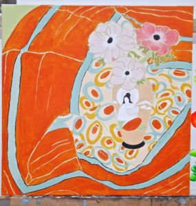
Janet E Davis, 3 pink anemones in an oriental vase – stage 6, acrylics on canvas, March 2014.

Janet E Davis, 3 pink anemones in an oriental vase – stage 7, acrylics on canvas, March 2014.
I will try photographing again in daylight. I don’t know what to expect. I might have to look at it for a few days to work out whether I like it.
3rd April
I started off with photographing the previous stage (picture below on the left) since it was daylight, even if not a bright level of light. I’m still not sure about the fluorescent green lines – whether they work or not – but they are growing on me.
Today, I concentrated on the detail of the figure on the vase before hesitating about whether to add the leaves to the green borders on the scarf. I decided to go ahead, and to add the black lines to the scarf’s ovals pattern. I didn’t quite finish that this afternoon, and was unsure that it worked.

Janet E Davis, 3 pink anemones in an oriental vase – stage 8, acrylics on canvas, March 2014.

Janet E Davis, 3 pink anemones in an oriental vase – stage 9, acrylics on canvas, March 2014.


