“Welcome to the Artists’ Book Market.”

Entrance to the Baltic Mill.
This is the third of the Baltic Artists Book Markets that I have attended. This one was held on Friday 10th and Saturday 11th July at the Baltic Mill, Gateshead. I went to the first because I knew of it through Theresa Easton who organises them – and I found it interesting. The second one had the added attraction of a couple of my friends from way back showing their work. I had thought I might try making some suitable work and getting a table myself for this year’s. The 2015 call for proposals happened before I’d put the thought into action however, so I decided to concentrate on seeing other people’s work, trying to take photos and tweet about the event to try to encourage others to visit.
It’s very difficult to explain to people the concept of the artist’s book in this context, especially in the medium of a 140-character tweet. Wikipedia’s definition is quite comprehensive, and the Smithsonian Libraries have a useful article What is an artist’s book? They can be books with very few words and a lot of pictures (including graphic novels and comics), or words used as images. They can be books made into sculptures, or sculptures that take the form of books, or are placed inside books, or inspired by books. They can be a collection of prints in a box. Artists’ books can take the form of maps, in the familiar fold of Ordnance Survey maps, or the almost flower-like Turkish fold maps – but with images that don’t necessarily describe topography in a traditional manner. The artists’ books can one-off objects, or limited editions, or mass-produced.
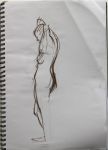
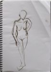
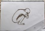
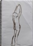
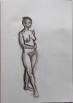
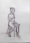
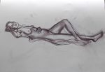
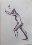
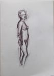
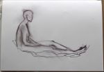
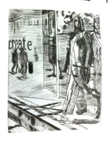
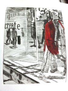
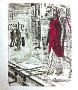
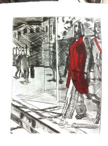
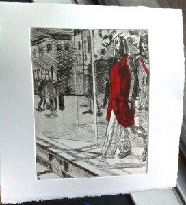
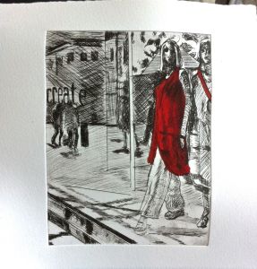
I think there was every kind of artists’ book at the event at the Baltic, plus art and photography books. When I arrived I had a quick chat with Theresa who then introduced me to Pete Kennedy, an artist who had come up from Essex for the event. I think I possibly needed the whole of the two days just to start to understand Pete’s work because there were a lot of ideas in it and ideas expressed in different forms. As you can see from the pictures, Pete makes almost every kind of artist’s book. The prints of pots (first picture below, and on the left in the second) made with words were immediately noticeable, and I would have liked to read all those and find out more about the making of those. The heads in the concertina-folded book (second row, middle picture) kept catching my eye over the two days – there seemed to be a whole book of stories going on just in those images. Unfortunately, I missed Pete’s performance the next day. I would like to have seen it.

Work by Pete Kennedy.

Work by Pete Kennedy.

Work by Pete Kennedy.

Work by Pete Kennedy.

Work by Pete Kennedy.

Work by Pete Kennedy.
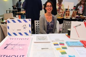
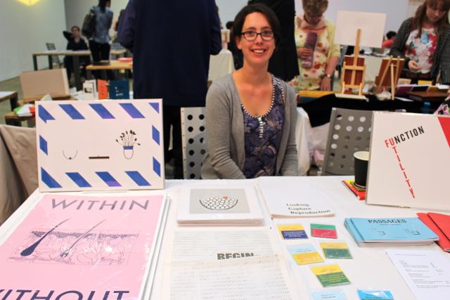
Amelia Crouch at her table – she also had videos playing at the entrance.
I didn’t get round all the stalls. There was so much to see and talk about with the artists. I only got to one talk – by Amelia Crouch – but that one was very interesting and thought-provoking. As well as talking a bit about her work, she showed us Nor stamp hard on the ground neither which I liked a lot, especially the use of archives in it and the considering of how people in the past walked in a landscape attributed to Capability Brown. I don’t usually seek out video art (possibly scarred for life by some I saw in the late 1970s to early 1980s), but I often do like artists’ videos when I do see them.
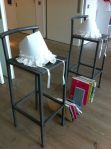
Paper bonnets on chairs.
I also catch a little of a performance at the entrance to the market. The paper bonnets placed on the high stools had intrigued me as I had gone in and out.
It wasn’t until the second afternoon that I discovered that they were part of a performance that involved Jane Austen, I think, and included reading out the punctuation. It was lovely, and I wished I could have watched the whole performance.
Stef and Ian Mitchell have very different approaches, working in different ways, but what they produce works together. They both focus mostly on the environment, Stef primarily on the natural environment, Ian on both natural and built or designed environments. Ian’s images are very precisely drawn, with the lines and colours refined to abstracts in some work, and there’s usually a fluidity and sense of movement in the lines. Some of Ian’s pieces are impossible to appreciate without seeing and handling them because the the thickness and weight of the covers make them almost sculptural, and he has used reflective materials that can’t be shown well in photographs.
Stef works a lot with plants, using them as a main element in her prints. The precise elements of her work tend to be a counterpoint to the materials apparently doing their own thing within the parameters she sets. Her palette is often very limited or monochrome, but the overall effect can be more colourful that one would expect, and she achieves depth through layering. As well as having a sense of place, both Stef’s and Ian’s work have a sense of time and of travelling through the landscape, sometimes slowly, sometimes swiftly.

Stef Mitchell’s monoprinted folded books.

Stef Mitchell’s monoprinted books.

Stef Mitchell’s monoprinted folded books.

Stef Mitchell’s monoprinted books.

Stef Mitchell’s monoprinted books.

Ian Mitchell’s work.

Ian Mitchell’s more abstract pieces.

One of Stef Mitchell’s small folded books.

Stef and Ian Mitchell’s table.

Stef Mitchell’s small folded books.
Laura Little’s Pink Parrot Press books contain images that made me smile. She is obviously a talented illustrator. I recommend having a look at her website if you haven’t seen her work yet.
There was a table of a small collective or group of new and recent graduates from several European countries. I was quite curious about how they had managed to meet each other and ended up showing their work in Gateshead. I always enjoy seeing artistic influences from different places.
The Leeds Surrealist Group table was intriguing. I was surprised to find a surrealist group. I was even more surprised to hear from the lady who was at their table when I visited that some of the original surrealist groups still existed and that the Leeds Group communicates with them. She explained that their publications were the physical product and evidence of their main activities. It wasn’t long before we discovered that we had both done the same art history degree course but a few years a part at Newcastle Polytechnic. That was unexpected. Some comparing of staff who taught us ensued. Some had left or started by the time she was an undergraduate, but we knew quite a few of the same ones.
There were several bookbinders, all of whom had lovely bound books to tempt, but the one whose name I remembered was Susan Davis because her surname is the same as mine. I could have blown my budget just on blank page notebooks/sketchbooks at this year’s market. If you want notebooks with unique or unusual covers, try an artists’ book market.

Laura Little and some of her Pink Parrot Press books and cards.

The international collective of recent graduates (I forgot the name).

One of the notebooks I bought.

The Leeds Surrealist Group’s table.

Publications including Phosphor on The Leeds Surrealist Group’s table.

Manticore on the Leeds Surrealist Group’s table.
Joanna Wilkinson’s sense of humour was immediately obvious in her work on display. I enjoyed chatting with her and her sister Lindsay whilst I explored the work. Each and every piece was intriguing. I really like Jo’s style – including the surprises in the little books – and look forward to seeing more of her work.

Joanna Wilkinson and her sister Lindsay.

Some of Joanna Wilkinson’s work.

There were delightful surprises in Joanna’s little books.

Joanna Wilkinson and her work.
I enjoyed having a chat with local artists Colleen Fernandez and Dee Thalia Shaw about what it used to be like when all lecturers on a fine art degree course could be men. I hope to meet them again before too long.

Colleen Fernandez.

Dee Ward.
Kim Bevan’s work included monoprints, embossed prints, and mind-bogglingly fine cut out layered pictures. Some of them fitted into a standard size matchbox. Kim Bevan’s hair – with its interesting colours applied in an unusual way – was admired by many of us. I do wish I had the confidence for such a bold coiffure. I’ve never even had my entire hair bleached or dyed black, let alone coloured bands.

Kim Bevan and her table.

A lovely selection of badges by Kim Bevan.

Kim Bevan cut work.

Extraordinary match box books.
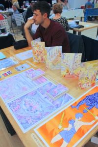
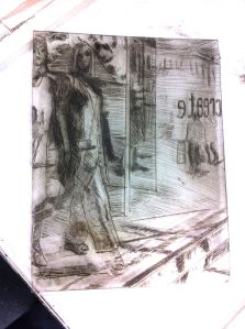
Tom Kindley and his table of comics.
The unusually bright colours of Tom Kindley‘s comics called out to me whenever I passed his table but I didn’t get to speak to him till the end. He’s another recent graduate, and we discovered that we’re fellow members of Northern Print so naturally we had a brief chat about that.
I wished him luck with getting paid work as a full time illustrator. Hopefully, his interesting style should get him noticed.
The Baltic Artists’ Book Market was great fun as a visitor. I could have done with a few more days to explore all the work there and talk to everyone. I think I should make an effort to make some books so I could apply for a table at the next market. It is a good opportunity to show small work in a relaxed way at the same time as networking with a very varied group of artists and illustrators.
Incidentally, I couldn’t resist buying some work, and the secondhand library art books were also just too tempting. I would love to have bought more if I’d had more money and could have carried more. I do recommend artists book markets or fairs as an excellent way of starting an art collection at very affordable prices eg £10 or less for an original, unique work of art. You can pack a big collection of them into one chest of drawers, so you could collect a lot over the years without having to remortgage your house or sell your soul – and have a lot of fun doing so.
The below list of links is to the websites of just some of the artists or groups I met at the Baltic Artists Book Market.
Theresa Easton
Theresa Easton, Artists’ Book Market BALTIC 10 & 11 July – Theresa’s post about the event with lots of links to the artists’ websites and lots more pics of the event.
Field and Hedgerow – Stef Mitchell’s printmaking blog.
Ian Mitchell
Staithes Studios Gallery – website for Stef and Ian Mitchell’s studios and gallery.
Amelia Crouch
Joanna Wilkinson
apulhed tinking – the activities of Pete Kennedy
Pete Kennedy, It’s not just the books! Apulhed tinking. Pete’s account of the Baltic Artists Book Market with a detailed account of his performance.
Leeds Surrealist Group
Surrealist Editions
Mark Connolly
Kim Bevan
Tom Kindley
Colleen Fernandez
Dee Thalia Shaw
Pink Parrot Press
aglu – books and photography