-

- Examples of Van Dyke prints shown to us at the beginning of the course.
-

- Gathered round the venerable old Mac to digitally tweak the images and turn them into negatives.
I put my name down for this course just the previous afternoon. I hadn’t thought that I wanted to learn this technique, mainly because the resulting print is sepia in colour. I have a bit of a thing about sepia-tinted photographs because I have worked with collections of historical images and found people tend to want to use the stereotype of sepia = historical photograph. When I was leading a project to digitise local history images in 2002 to 2004, I wouldn’t let anyone use any shade of sepia in the website design. I loathe the nostalgia-fest look.
The Van Dyke technique is a photographic technique of printmaking, so I was concerned we’d end up with images that just looked like old photos turned a sepia colour for a nostalgic newspaper supplement. Then I had spotted that the examples Northern Print showed had interesting edges and had the potential to look like indie band album covers. I decided it was a good technique to learn – just in case I ever come across an indie band who’d like to commission me to create that sort of an album cover and publicity shot.

The negative and horizontally flipped image.
Andrew Wright was our tutor. He gave an overview and showed us examples of Van Dyke prints, explaining what had worked and what hadn’t worked so well. He warned us that the results can be a bit unpredictable.
We painted some paper with the photo-sensitive Van Dyke solution in two layers, with some drying time in between layers and after.
We had each brought a few colour images on USB sticks. Andrew advised on which might work best, some basic enhancements to increase the chance of the picture working in the Van Dyke process, and how to change them from colour to a black-and-white negative on the computer in Photoshop (a quite elderly version), and flip horizontally. The images were printed out onto a type of acetate.

The test strip, with a blank strip in the middle.
The next stage was to do a test strip. We all put our 1st negative on the ultraviolet light box, picked an area that we thought would be a good area to test, preferably showing the full tonal range of the image, and used black card to block off the rest of the negative.
Andrew suggested trying three times with 20 seconds between them. The shortest time should produce the lightest print and the longest time the darkest. We moved the coated paper over the exposed strip of negative. Whilst waiting for the machine to work, we discussed the dangers of too much exposure to UV light. The middle exposure didn’t work, leaving the blank strip in the middle. This was because the UV light box had only pretended to work the second time.
-

- Gently agitating the prints in water.
-

- The one of the far end was the last tray, in which the prints stayed for the longest time.
After exposing the negative and paper to the light, we processed it in a series of trays of water, developer and more water.

Exposed for the same amount of time simultaneously but paper coated by different people.
Andrew had brought some paper he had prepared so we had plenty to work with and I was the first to try one of the pieces of paper I had prepared and one of that Andrew had prepared the previous evening.
As soon as I took them off the lightbox, I could see that they proved one of the points Andrew had made earlier about the variability of results.
The darker orange image is the paper that Andrew had prepared, the more yellow paper is the one I prepared. The paper had been coated with the same solution and both pieces of paper had been exposed for the same amount of time in the light box. The darker one turned out lighter when developed. It was difficult to tell how light or dark the print would be eventually. The colour changes as the print is processed and as it dries. The print may take a week or two to reach its eventual colour.
It was fascinating to see how the different images brought by the group worked. The gothic windows with the trees beyond, photographs of buildings in Rome worked really well. The photo of trees shown below looked as if there were a light layer of snow on the leaves and retained fine detail.

Lots of our images in the final water soaking tray.

Photographing and drying the prints at the end of the day.
-
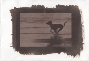
- Black dog running.
-
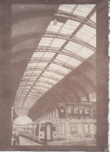
- Small York Station print on paper coated before the course.
-
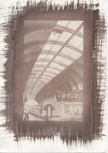
- Larger York Station print on paper coated before the course.
-
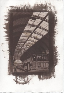
- Larger York Station on paper I coated during the course.
-
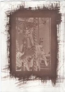
- Carousel on paper coated before the course.
-
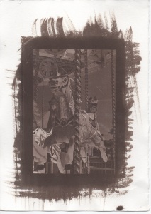
- Carousel on paper I coated during the course.
I thoroughly enjoyed the day. The people on the course were lovely. I realised halfway through the day that we were working in very collaborative and cooperative ways and had rapidly turned into a team.
I was happy with the prints I took home. I’m not sure whether I will try the process again (it’s not so easy to get the chemicals) but I do like the purple-brown colour of the darker prints and have wondered about experimenting with how the solution is painted onto the paper, perhaps at that stage creating a simple image that works with the photographic image. Maybe cutting the negative into a relevant shape would look interesting. I would like to try photos of some other subjects, especially portraits.
As I look at these images, I keep thinking that they’d look like indie rock album covers with just a title and a band name added. If any indie bands want to commission me, I’d definitely do some more.
